-1721172a-5ffa-48c2-a1a8-ad6d99053ef3.png)
Product cardUpdated 6 months ago
Configuring product card settings
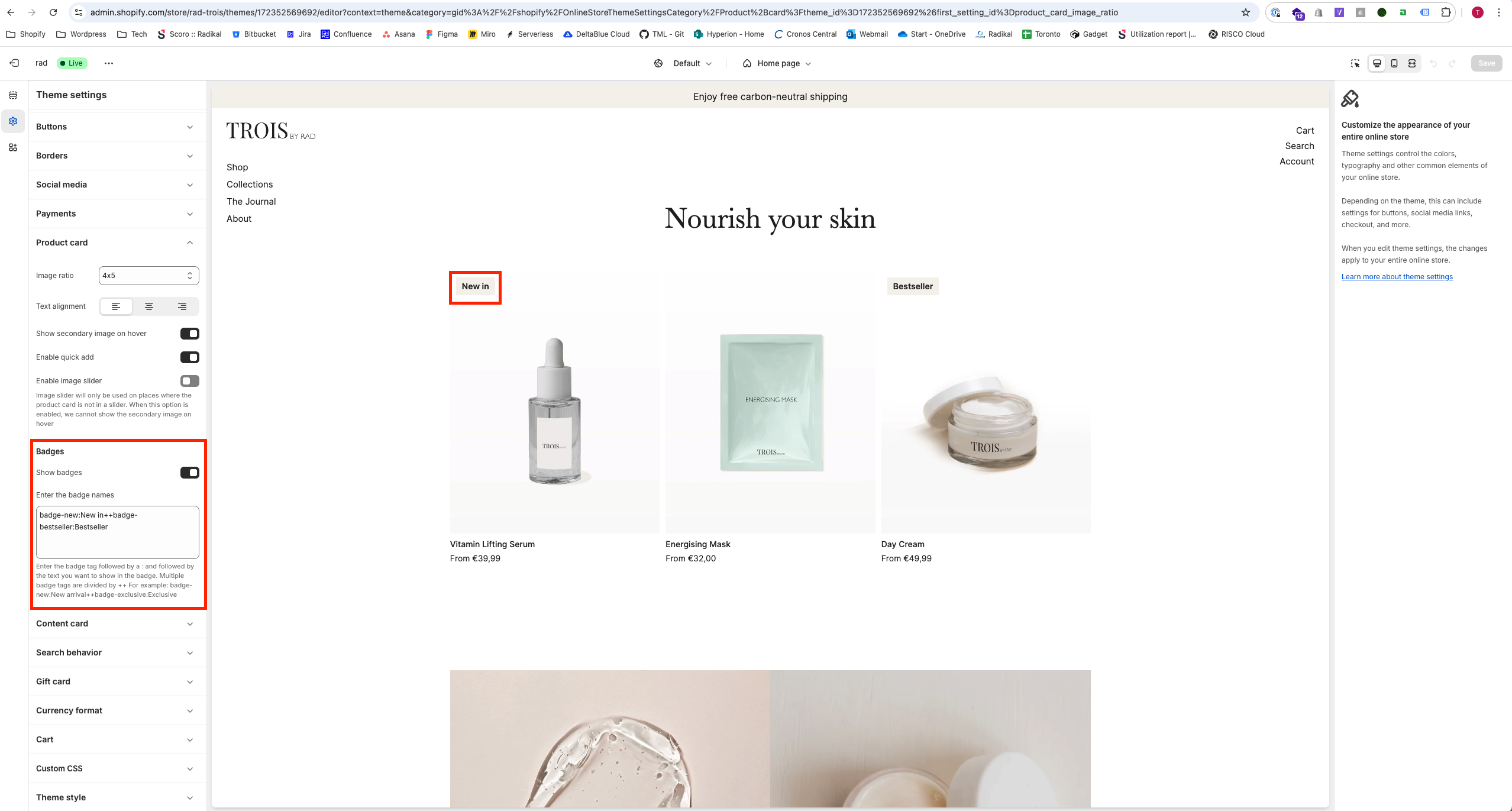
To customize the appearance and functionality of product cards, navigate to Online Store > Themes > Current Theme > Customize and go to Theme Settings > Product Card.
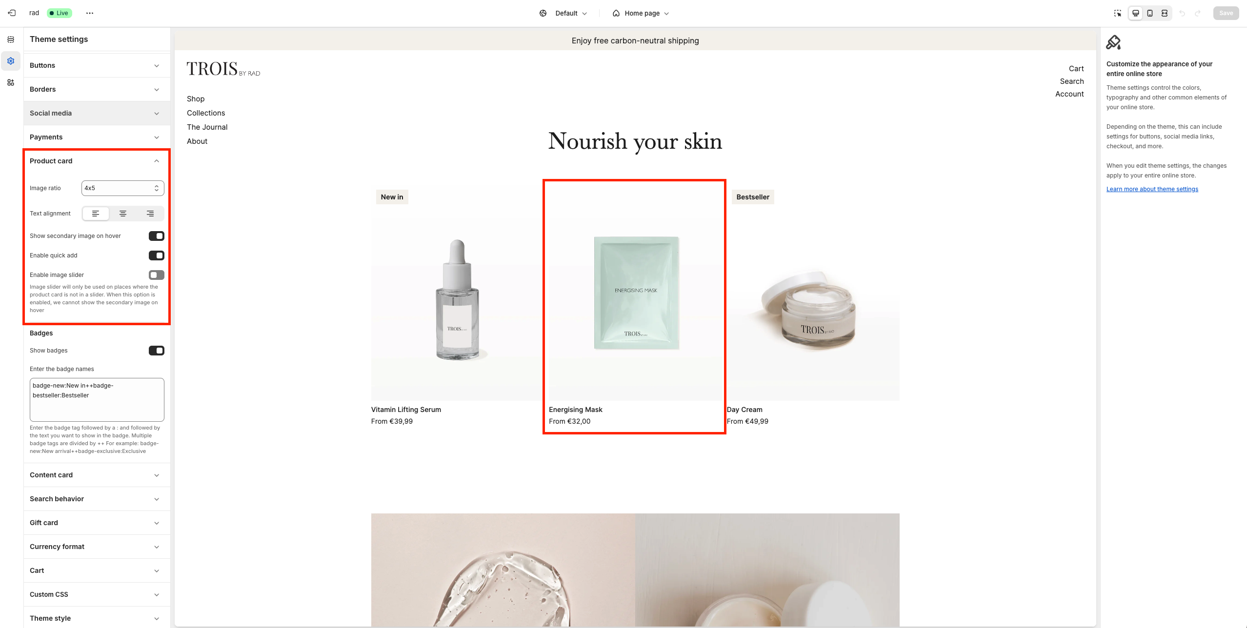
The product card visually represents products on collection pages, featured collection sections, and product recommendations.
Customization Options:
- Select Image Ratio: Define the aspect ratio of product images.
- Choose Alignment: Set the alignment of product details within the card.
- Show Secondary Image on Hover: Display a secondary product image when customers hover over the product card.
- Enable Quick Add: Allow customers to quickly add products to their cart directly from the product card.
- Enable Image Slider: Activates a slider for product images. Note: This option disables the Show Secondary Image on Hover feature.
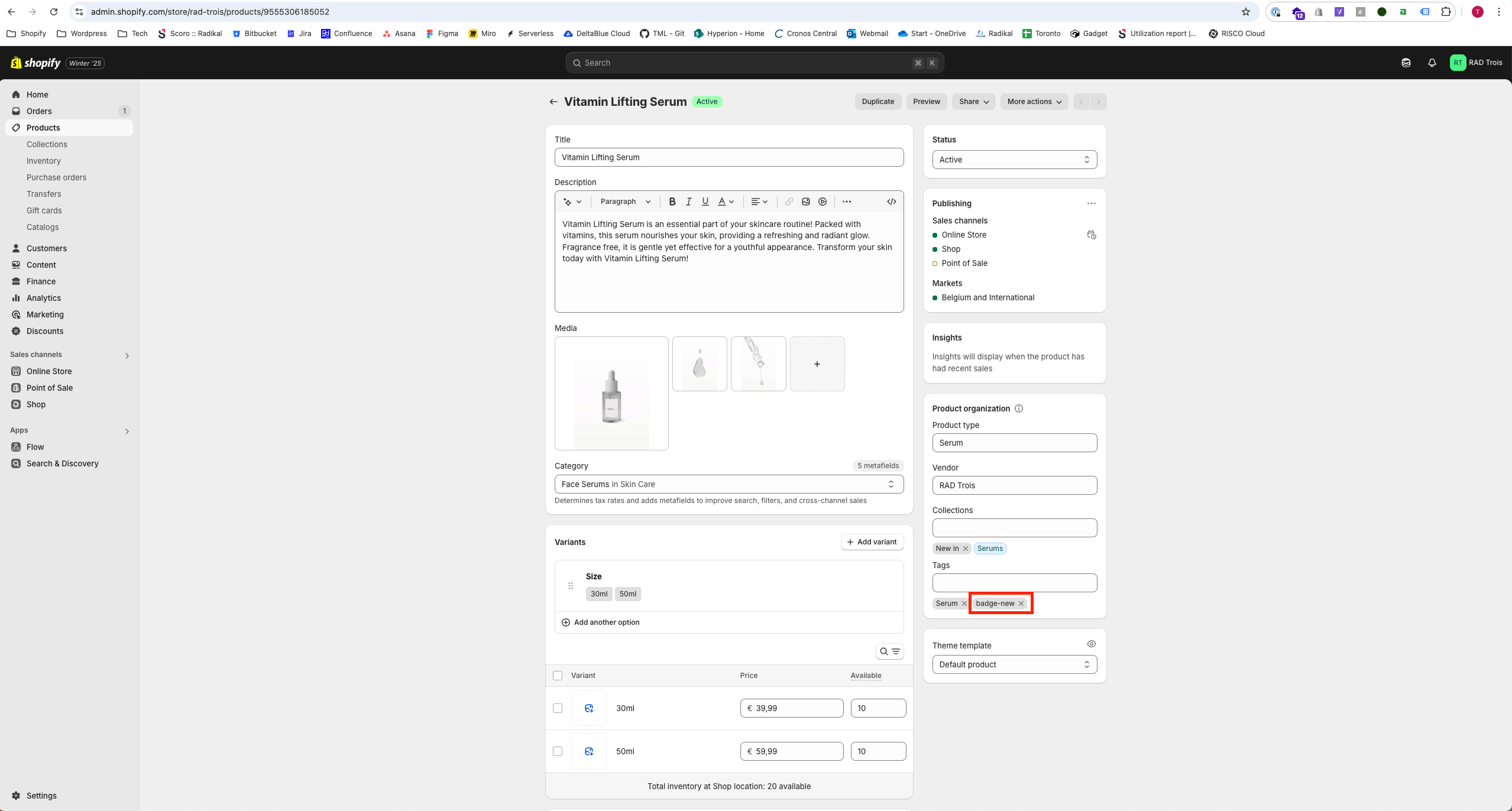
- Show Badges: Toggle the visibility of badges on product cards.
Configuring badges
Badges provide additional visual labels for products, such as "NEW" or "COMING SOON."
How to Add Badges:
- Enter the tag followed by a colon and the badge label.
- Example:
badge-new:NEWcreates a "NEW" badge.
- Example:
- Add multiple badges by separating them with
++.- Example:
badge-new:NEW++badge-comingsoon:COMING SOONcreates both "NEW" and "COMING SOON" badges.
- Example:
Display Behavior:
- Badges will appear on the product card and product detail page if the product has a matching tag and badges are enabled.