-1721172a-5ffa-48c2-a1a8-ad6d99053ef3.png)
SlideshowUpdated 7 months ago
Go to Online store > Themes > Current theme > Customize and select Slideshow.
Having slideshow sections in Shopify is beneficial because they create a visually impactful and engaging introduction to your online store, capturing visitors' attention. They allow you to showcase key products, promotions, or brand messaging, effectively conveying your store's unique value proposition. Additionally, slideshow sections provide an opportunity to establish a strong first impression and drive conversions by encouraging visitors to explore further and make a purchase.
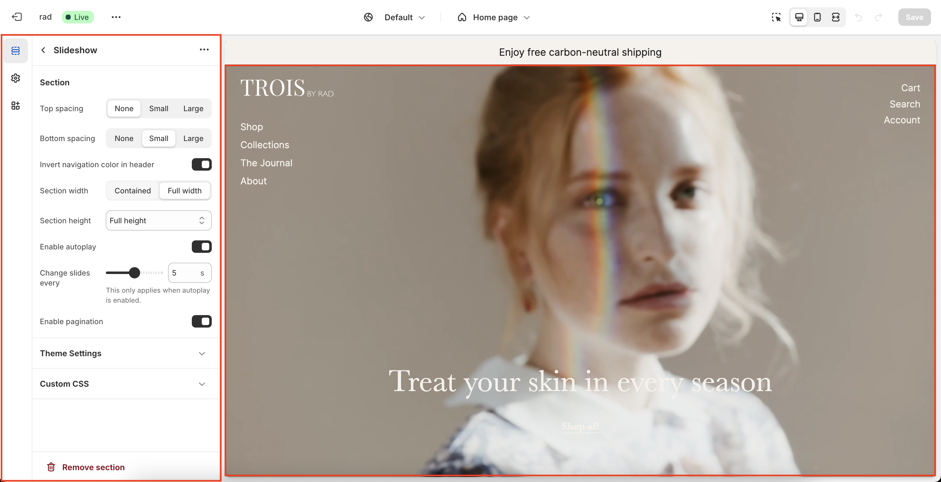
Section settings
Setting | Information |
| Section width | Make the section contained in the grid or full width |
| Section height | You can make the height of the section small, medium or full height. Small and medium are predefined heights, full height is 100% of the screen. |
Enable autoplay | Activate or deactivate the slider being used in the hero section. |
Enable pagination | This refers to the pagination (bullets) at the bottom of the slider. Activate or deactivate this by toggeling the checkbox. |
| Change slides every x seconds | For autoplay select the speed of changing slides |
To enable sliding functionality, it's important to remember that the slider requires a minimum of two slides. You can easily add additional slides by navigating to the left and clicking on the 'Add Slide' button.
Block settings
This will refer to the slides in the Slideshow.
Setting | Information |
Block Description | The slide block is used to create a slide for the slideshow. With each slide having it’s own settings, every slide can be different than the other. |
Block Width | Choose between contained or full width. |
Desktop media width | Choose between half or full width. |
Media position | Choose to the position of the media. Note: This only works width half media width. |
| Desktop content column width | Choose the width of the content |
| Vertical content position | Set the vertical position of the content |
| Content position | Set the horizontal position of the content |
| Content alignment | Set the alignment of the content |
Overlay color | Choose the color of the overlay that is on the media. |
Overlay opacity percentage | Set the opacity for the overlay. |
Image 1 | Choose the first image. |
Image 2 | Choose the second image. |
Mobile image 1 | Choose a mobile image for the first image. If not added, then the image 1 will be used for mobile too. |
Mobile image 2 | Choose a mobile image for the second image. If not added, then the image 2 will be used for mobile too. |
Mobile image ratio | Choose the ratio of mobile image. Note: This only works if the media size is half width. |
Video | Add a video to the current slide. |
Caption | You can add a caption to the current slide by filling in the input field or leave blank to hide the caption. |
Caption size | Set a size for the caption. |
Heading | You can add a heading to the current slide by filling in the input field or leave blank to hide the heading. |
Heading size | Set a size for the heading. |
Convert to H1 tag | Check the box to convert the heading tag to a H1 for better SEO. Note: There should only be one H1 tag per page. |
Text | Add extra information to the slide by filling in the text field or leave blank to hide the extra information. |
Text size | Set a size for the text. |
Button label | Text will be shown in the button. Note: Button will not show if the ‘button url’ field is blank. |
Button url | Add a link to the button displayed on the current slide. |
Button style | Set a style for the button displayed on the current slide |